
Data Visualization Best Practices: A Practical Guide For Getting The Most Out Of Your Data Viz
October 2023
This article is rated as:


Data visualization is a powerful means of effectively telling stories with data. Too often the key messages of our data are lost to the confines of some burdensome table or cluttered chart attempting to present too much information. Here I will outline simple processes to transform your data and make your charts more engaging.
Understand Your Data
It is tempting to jump straight into data visualization, but it is important to take a step back and think about why you are visualizing the data. Specifically, you should be clear on the purpose and context for your data visualizations. This is the time to reflect on your evaluation questions and determine how you may best address these questions with your data visualizations. Understanding why you are visualizing the data and how the data reflect your clients’ goals will improve both the clarity and impact of your visualizations.
Much of the understanding of your data may fall within your initial data exploration and analysis. However, it is just as important to question the data and resulting analyses prior to data visualization. Revisiting the data and resulting analyses will refine what should or should not be visualized and hone your decisions on which visuals will best tell the story of the data. Here are a few prompts to get you thinking about your data:
Are there any gaps in the data (either missing data files or incomplete data files) that are otherwise critical for addressing the evaluation questions?
Do I understand the data received? For example, are column headings clear or do I need clarification (e.g., a data dictionary) to better understand the data?
Chart Selection
While Excel does provide some chart recommendations, these are often far from ideal. It is better to reflect on the data at hand to answer a few questions that will guide you toward an appropriate data visualization. Luckily, we have a data viz decisions tree to help you get started in selecting the correct chart.
However, broadly speaking, many chart decisions for most evaluations can be narrowed by reflecting on the type of data and deciding from a handful of chart types. Despite there being an endless myriad of charts to choose from, data are best presented simply. Stick to the fundamentals and your data visualizations will be more coherent and will better convey your client’s stories.

The above chart selections are but a handful of all the data visualization possibilities. However, each of these charts can be customized to suit your evaluation questions. For example, bar charts can be replaced with lollipop charts and line charts can be replaced with area charts. However, master the basics before adding variation and complexity into your data visualizations.
Building the Foundation for Better Data Visualizations
Just as there are nearly infinite different data visualizations to choose from, so too are there an infinite number of ways to format your data visualizations. That being said, if you focus on building a few foundational data visualizations, with presets that accentuate your data, then your starting point becomes much clearer.
Data Points
Bar Width
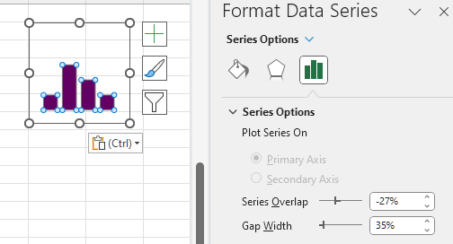
Bar and column charts are the bread and butter of data visualization. They are simple in their execution but are unparalleled in their ability to present data effectively. Personally, I find the default bar widths to be too narrow. Broadening the bar widths helps fill out the bar (or column) chart to better accentuate the data.
Adjusting bar widths:
Left click on any bar within your chart.
Right click (or use the keyboard shortcut Ctrl + 1) to Format Data Series.
Adjust the bar width by changing the Gap Width.
A smaller percentage increases the bar width, while a larger percentage decreases the bar width.
35% is my preferred bar width for most data visualizations. However, this may vary depending on the number of categories presented.
Line Thickness
A pencil thin line when presenting time series data can be hard to read. Thicken the line and trends will be much more apparent. While the Excel default is not bad (2.25 pt), often a slightly thicker line will be easier to read. This becomes even more useful when presenting multiple lines in a single chart. Thickening the line of interest will make it pop and better emphasize the most important information.
Adjusting line widths:
Left click on the line within your chart.
Select the Fill & Line heading.
Adjust the line width by changing the Width.
Between 2.5 – 3.0 pt is my preferred sweet spot for emphasizing key data.

Marker Size (for Line Charts)
Depending on the data, you may opt to include or exclude markers in your line charts. With extensive time series data covering dozens of data points, data markers can become an eyesore. However, with a few select points, the use of markers can help to highlight your data points.
Adding Data Markers:
Left click on the line within your chart.
Select the Fill & Line heading.
Go to the Marker tab at the top of the Format Data Series menu.
Under Marker Options you can select a Built-in option with varying shapes. Although I recommend only using the filled circle if adding in data markers.
Data Marker Tips:
If size permits, a larger data marker will allow for data labels to be centred nicely within the data marker itself. A marker size of 3-5 pts larger than your data label font is typically sufficient.
With longer time series data, you can opt for smaller data marker (5 pt) to highlight each point within the time series.
Colours and Fonts
Colour Palettes
Sometimes we are constrained when it comes to selecting a colour palette. That is, our client may already have colours pre-selected based on their own company colour palette. However, there are items within our control that will make our data visualizations pop. For example, we can use a client’s main colour to emphasize important information. Or we can use a gradient of their main colour to present like information, as in a stacked bar chart.
Colour Palette Tips:
Create your own palette to build a custom set of colours with primary and secondary colours for your data viz.
Darker, more saturated colours draw attention first. Reserve these colours for highlighting the key information in your data visualizations.
Gradients of the primary colour can be useful in presenting like data, such as in stacked bar charts.
Avoid using green and red to exclusively mean good or bad results. It is better to use colour to emphasize the key message rather than focus on an arbitrary distinction of desirable and undesirable results. Undesirable results, if highlighted, can bring attention to areas for improvement.
Creating a Colour Palette:
Left click on the Page Layout tab at the top of Excel.
Under Colors you will be provided with some default Office colour palettes. To create your own custom colour palette, click on Customize Colors… at the bottom of the dropdown menu.
Within Customize Colors… you will be given the option to modify text, accent, and hyperlink theme colors. Simply click on any colour you wish to change. Use More Colors… to get more options for updating your colour palette.
Customizing your colours works well if you have the Hex codes.
Save the colour palette after providing a suitable Name to reference the palette in the future.

A Few Resources for Picking a Colour Palette:
Coolors: Import an image or logo to extract colours and colour palettes
Microsoft PowerToys: The Color Picker tool within this Microsoft application will allow you to get colour codes from any image on your screen.
Sharing a Colour Palette:
Left click on the Page Layout tab at the top of Excel.
Under Themes located the Save Current Theme… option (ensure that your desired colour palette is already selected).
Save your colour palette on your computer or within a shared team folder.
Simply link or email the colour palette to any other team member that may require the use of the colour palette.
Fonts
Similarly, fonts may be pre-determined by your client or team. However, when it comes to data visualizations, always opt for a sans serif font. Serif fonts will clutter your charts and make smaller data labels more difficult to read, as these fonts use valuable space with your charts.
Font Tips:
Always use sans serif fonts for data visualizations.
Condensed fonts may help free up valuable space within your data visualizations (I have found some success with Franklin Gothic Medium Cond).
While the theme fonts for a project may be preselected, we usually have control over the size of said font. For data visualizations, consistency is the most important aspect when deciding on font sizes. Nothing is more distracting than identical looking charts with varying font sizes.
Font Size Tips:
Titles and headings (should) emphasize the key findings of each data visualization and, thus, should be the largest. Reference your company or client’s style guide if available. If not, fonts of 14 pt size are good for main titles with a slightly smaller font (12 pt) being good for subtitles.
Axis font size only needs to be large enough that they are easily readable. I usually default to a 9 pt font for axis labels.
Similarly, data labels only need to be large enough to read. Like the axis font, I default to a 9 pt font. Although, you can use a large font or bolding to emphasize key values.
Miscellaneous
Gridlines
Often, data points will already be labelled. If so, gridlines are just visual clutter that offer little for the overall comprehension of your visualization; actually, they may even hinder the overall interpretation of a data visualization.
Gridline Tips:
If data points are labelled, scrap the gridlines for a cleaner, more aesthetic looking visual.
If you are presenting many data points, keep the gridlines. Sometimes labelling too many data points clutters the end visual. Drop data labels in favour of gridlines if this is the case.
If including gridlines, adjust the Bounds of the axis to appropriate units. Too many major gridlines and the message will be lost.

Y-Axis Scaling
If possible, always start with a zero baseline on the y-axis. Keeping a consistent baseline will allow for more direct comparison between similar charts, while not overemphasizing otherwise minimal differences between data points.
Additional Tips and Recommendations
Remove the clutter. To get the most out of data visualizations, it is best to strip each chart to only what is necessary. Titles can be replaced with your own custom, engaging titles that actually explain what the data show. Gridlines can be dropped if your data bars are already labelled. Clutter is distracting, so focus each data visualization down to the critical pieces of information and highlight them. This will make your data visualizations appear more professional with the added benefit of being interpretable. For more tips on creating better data visualizations, check out our top seven tips.
Use chart templates to save time. Formatting charts from scratch is time intensive, so leverage the use of custom chart templates to quickly convert similar charts into the same style. This will maintain consistency across your visuals while saving you precious time.
Wrapping Up
There are many things to consider when building data visualizations. From chart selection to formatting, this guide is designed to narrow the scope of what makes a good data visualization by stripping away the need for overly complex and burdensome data visuals. By focusing on a few basic chart types and fundamental chart formatting tips, you will be able to craft custom and effective data visualizations no matter the data thrown your way.