
Consistency Is Cool
October 2020 (Updated September 2025)
This article is rated as:


Six Hacks for Renovating Your Evaluation Report
Part 2
This series of posts walks you through how to reno your evaluation reports using six of Canva’s design lessons. Part 1 focused on how to take your audience on a journey using storytelling techniques. Part 2 in this six-part series focuses on how to format your report with a consistent, cohesive look using two formatting elements: colour and font.
Patterns make learning easier
Human brains love taking in information. Visual information is our brain’s favourite information – it is our brain’s priority sense. Because of our brain’s proclivity for information, they are constantly searching for visual cues (e.g., shapes) and particular attributes of those cues (e.g. colour, size, texture, angle, etc.). When our brains see those cues, they try to process that information as easily and efficiently as possible. Over the years, our brains have evolved to adapt the ‘work smarter, not harder’ mentality; our brains look for patterns because it makes learning easier.
We need to take advantage of our lazy (but evolved) brains with our evaluation reporting. Let’s make reading our reports as easy as possible by giving our brains some consistent patterns that increase the chances our readers will more easily learn the information we are trying to convey. Two easy ways you can create a consistent, cohesive look in your evaluation report are through the consistent use of colour and font.
Using colour consistently
When you are using colour in your report, you want to think about two things: 1) Creating a strong palette and 2) Considering colour theory. There is no need to reinvent the colour wheel. You can find strong colour palettes using sites like Coolors, ColourLovers, or Adobe Color. My colour palette is often inspired by an image I used for my report. Most of the sites I just mentioned will allow you to upload an image and create a palette based on the colours in that image.
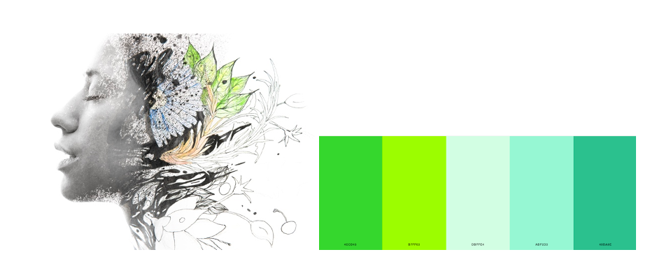
The image above was used for a report I did where the outcomes were focused on women’s wellness and well-being. Using that image, I developed a colour palette that focused mainly on the greens in the picture. I chose green because green is often associated with concepts like nature, peace, growth, and health – concepts related to the intended outcomes. Being intentional about your choice of colour and the mood it conveys is being considerate of colour theory, but also helping our brain with pattern recognition.
Once you’ve decided on your palette, you can create a custom palette in Microsoft and use it throughout your report to create a consistent, cohesive look to your report. The image below shows how I used the colour palette throughout the report (i.e., in tables, graphs, and call-out boxes), along with the cropped sections of the main image, to create consistency throughout the report.
Using font consistently
Another way to create consistency throughout your report is with fonts. Similar to colour, fonts should be used purposefully to signal important elements. The best way to do this is to create hierarchies in your report. This means your titles, subtitles and heading levels have different fonts, formatted differently, but used consistently throughout your report to create a report hierarchy (see below).
An easy way to make sure you are using your fonts consistently is to use the style pane in Microsoft and set up your font hierarchy. You can also do it manually using a table like this:
For each heading style (e.g., Title, Sub-title, Heading 1) include information on font type, font size, font RGB (colour), and font style.
You want to make sure that the fonts you choose accurately reflect the mood you want to portray. Similar to colour, our brains have ingrained ideas of fonts and the personality each represents. In our storytelling with data workshop, we illustrate this by showing words from our Constitution Act in two different fonts (see below). As you can see, the Comic Sans font on the right looks more appropriate as a note to a child.
A comparison of Canada's constitution in a serif font vs. comic sans
Remember, creating consistency in our reporting isn’t just about formatting elements consistently throughout your report, but choosing elements (e.g., colour and font) that are consistent with what your audience expects.