
Qualtrics Automated Reporting - A How-To Guide
December 2023
This article is rated as:


Regular in-depth analyses are important to provide accurate and meaningful insights and recommendations. However, it can also be useful for clients to be able to view summaries of their data between regular reporting intervals. I recently learned about Qualtrics’ automated reporting feature, and it has been a game changer! With some simple set-up, we’ve been able to create custom reports that automatically update with new responses for our clients to access at the click of a button.
My favourite features:
1. Real time updates: Although it’s always best to collect as many responses as possible to provide insights and recommendations from surveys, it can be useful to have a glimpse into the responses as they come in. Using custom reports in Qualtrics, we can provide clients with a visual summary of the data as it comes in, whether or not they are Qualtrics users themselves!
2. Easy-to-use customizations: The ability to customize reports for your clients is hugely important. Not only does this allow you to personalize the report to match their organization’s brand identity (which can go a long way in how that report is used and shared), it gives you the flexibility to tailor the report to the needs of the client. For example, we may collect data on the date the survey was completed so we can provide insights on how participant satisfaction changed over time in our final report, but this information isn’t relevant to the client who just wants to see the overall satisfaction at any given time. Using this tool, we can pick and choose which data is summarized in charts and tables to give our clients only the information they want, without burdening them with an entire data set.
3. Scheduled sharing: This feature is super useful for clients who want to see updated reports on a regular basis but prefer to receive them via email than by using the link to view the report online. Using Qualtrics, we can set up automated emails containing a report of the most recent survey responses to send to the client’s inbox at regularly scheduled intervals (weekly or monthly). This alleviates the burden of scheduling in time to check results from the client and saves you the trouble of manually emailing updates each week.
How to use Automated Reports:
1. Generating Test Data (recommended)
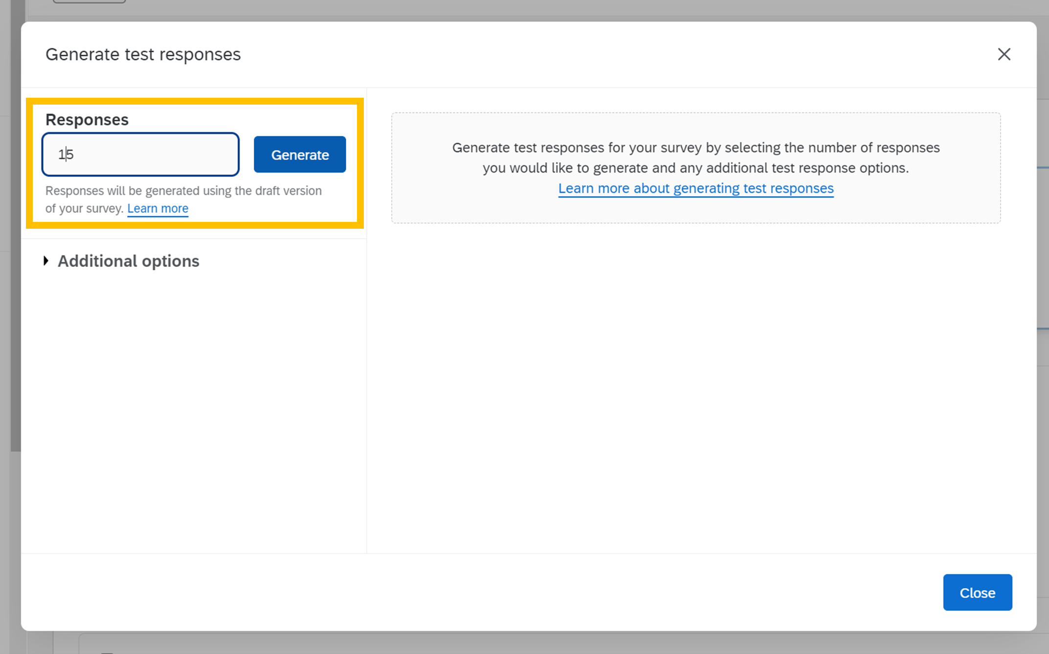
Once you have your survey developed (even before you’ve started to collect responses!), you can set up the layout and look of your report. While you can make the report without any data, I like to first generate test responses using Qualtrics’ built in feature so that I can preview what the charts and tables will look like with real responses. To do this, click on the Tools drop-down menu in your survey view, and select ‘Generate Test Responses’:

In the new window, specify how many test responses you want to generate (here I went with 15) then click generate.
After a few seconds, Qualtrics will successfully generate test responses – if your summary looks something like the one below, you know this worked properly. Click ‘Close’.

Important! Don’t forget to delete your dummy data before launching the survey so that the test responses aren’t included in your report.
2. Building the Report
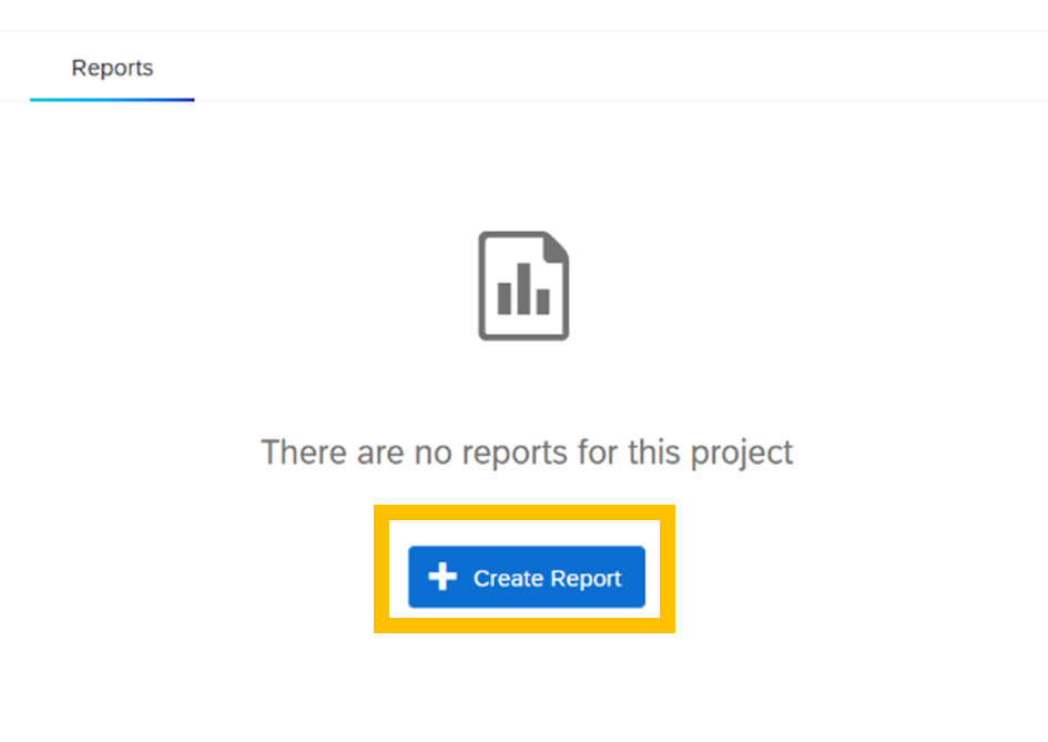
Once you have some test data to work with, navigate over to the ‘Reports’ tab at the top of your survey view.

If you haven’t used the reports tab before for the project you are working in, you will see the following screen – click ‘Create Report’ to start preparing your first report.
Give your report a name (you can always change this later!), choose the page size and orientation to your preferences, and click ‘Create’.

You will now have a blank report draft that is fully empty, with a button to insert a new section. Click ‘Insert’ to choose what you’d like to insert into your report. You’ll have some options to insert survey data, data from other projects, or design aspects like images and page dividers. In this article I will show you the basics of adding in data visualizations, but feel free to play around with these options as needed for your own report.
3. Adding Visualizations for Survey Data to your Report
There are two ways to add visualizations to your report.
a. Click ‘Insert’, then ‘Questions’, and choose the question that you want to display data from. Qualtrics will automatically choose a graph style for your data, but you can change this to best fit your data type.

OR
b. Click ‘Insert’, then ‘Visualizations’, and choose the type of graph or table that you’d like to display in your report. In the pane that opens to the right, select the question that you want to pull data from by clicking ‘Add Metric’, then clicking ‘Select a field’ and choosing the question from the drop-down menu.

Tip: check out our Data Visualization Decision Tree here if you’re not sure how to best display your data!
If the settings pane is not already open, click on the graph to open it up. This pane contains options for your data viz, allowing you to change the metric you’d like to display, add filters, and change how the graph is displayed to suit your preferences.
You can also double-click into the chart title to rename it.

4. Breaking Out Responses (optional)
The last customization we’ll touch on in this article is the Breakout option: this allows you to split out the report data by some variable within your survey. In this case, I will split out satisfaction data by the program sessions respondents attended.
Click ‘Insert’ to insert another report aspect and follow the instructions in Step 3 to insert a graph. To breakout the bar chart based on participants’ responses to another survey question (in this case, which group of sessions they attended), click the drop-down menu under Breakout, and choose the question containing the data you want to group by.

This will visually separate out the responses in your graph.

Adjust the Settings and Style options in the right panel until your graph fits your preferences.

5. Customizing the Report using Images, Page Dividers, and Sections
To add visual interest and improve the flow of your report, you may choose to add images, text boxes, dividers, or page breaks by clicking ‘Insert’ and following the appropriate steps below.
a. Images
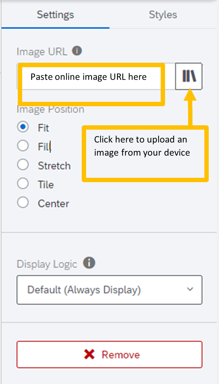
Select ‘Image’ from the ‘Insert’ menu. If you are using an image from the web, simply copy and paste the image URL into the ‘Image URL’ field in the settings pane. To add an image saved to your device, click the button just beside the Image URL field to open up your Qualtrics Graphics Libraries browser. In the Graphic Libraries browser, click ‘Upload Image’ and select the image from your files to upload it to Qualtrics.
You can then drag the corners of the blue box around your image to resize it or move the image to a different place in your report by clicking on the image itself and dragging it to where you’d like it.
b. Text Boxes
Choose ‘Text’, then ‘Text Area’ from the ‘Insert’ drop-down menu. Double click into the text box to change the contents, and to format the text to your preferences using the Text Formatting options at the top of your screen.

c. Dividers
Choose ‘Divider’ from the ‘Insert’ menu to insert a horizontal bar that helps to visually separate sections of your report. You can customize the colour, orientation, and width of the bar in the Settings pane to the right to match your needs and preferences.
d. Page Breaks
Choose ‘Page Break’ from the ‘Insert’ drop-down menu to jump to the next page of your report. This option will tell Qualtrics to place any new visualizations or report aspects onto a new page, which can be helpful in improving the flow of multi-page reports. To remove a page break, simply hover your mouse over the ‘Page Break’ indicator and click the ‘x’ that appears next to it.

Insert as many visualizations and customized aspects as you need for your report! If you’re having trouble getting started, check out our Qualtrics Report Template available for download as a .qrf file!
Preview the report template here, or download the template here.
6. Sharing Your Report
There are a few ways you can share your report with colleagues, clients, and the public.
a. PDF
To download and share your report as a static PDF (i.e., this PDF will not change as new data is received), in your report view select ‘Share’ and choose ‘Download PDF’ from the dropdown menu. Save this file to a location on your device, and share the PDF as you would any other file type (e.g., by email).

b. Live Link
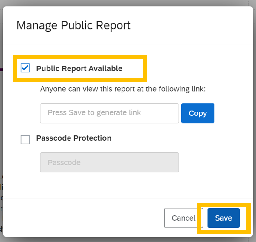
Alternatively, you can share a live version of your report (meaning that this report will change to reflect newly received data), select ‘Share’ when viewing your report, then select ‘Manage Public Report…’.

Click the checkbox so that ‘Public Report Available’ is enabled, then click ‘Save’ to generate a unique link to your report. Next, click ‘Copy’ beside the field where the link appeared. You can now paste this link into your URL bar, or paste it in an accessible location for your audience (e.g., in an email to your colleagues and/or clients, on your website for the public, etc.). I like to tell clients to save this link as a bookmark or in an easy-to-access document so they can view the report at any time.

Require a password to view the live link (optional): You may choose to password protect your live link by checking the box next to ‘Passcode Protection’ and choosing a passcode to share with your target audience members. Click ‘Save’ to enable changes.

c. By Email
To set up one-time or regularly occurring emails containing updated report versions as a PDF, select ‘Schedule Email…’ from the drop-down ‘Share’ menu when viewing your report.

Create a new email by clicking ‘New Email’. Fill out the ‘Your Name’, ‘Subject’, and ‘Message’ to send as a one-time email, or to schedule recurring emails with updated reports.
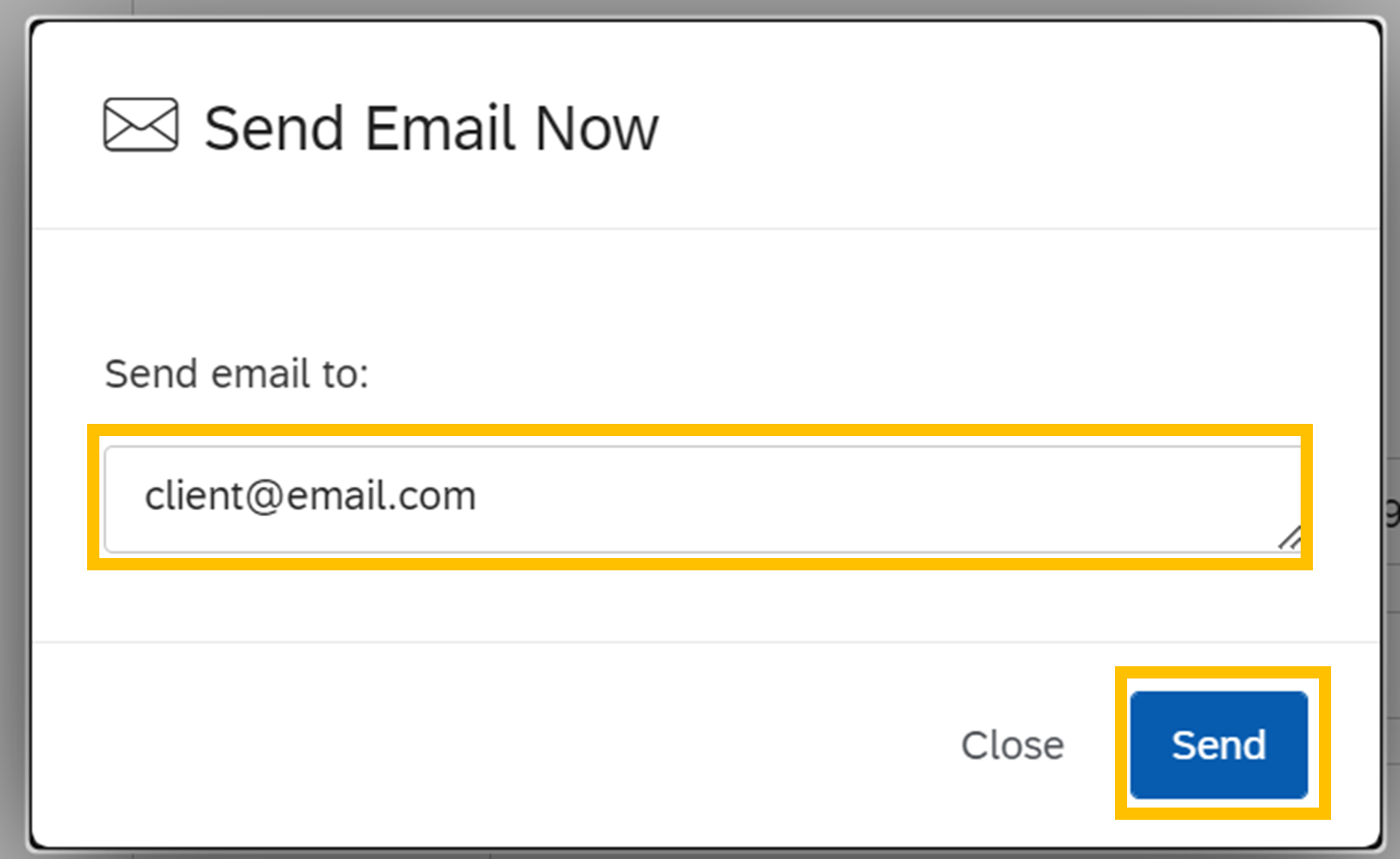
To send a one-time email: After filling out the fields noted in the previous step, click ‘Send Email Now’.

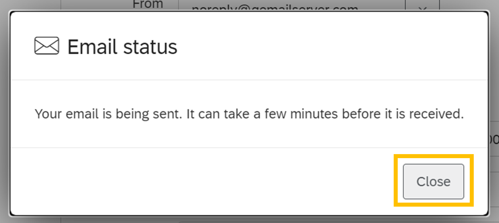
Enter the email address(es) of your intended recipient(s) into the field in the pop-up window, then click ‘Send’. You will receive a pop-up message letting you know that your email is being sent and should be received within a few minutes. Click ‘Close’ on the pop-up window, and ‘Close’ in the ‘Schedule Email’ window.
To schedule a recurring email: Specify your recipients’ email addresses in the ‘To’ field. Then use the drop-down ‘When’ menu to specify how frequently and on what date and time the emails should be sent, then click ‘Create’.

This will save your scheduled email draft and automatically send it to the recipient list specified in the ‘To’ field on the date and time specified in the ‘When’ fields. Click ‘Update’ to ensure your changes have saved, and then ‘Close’.
REMEMBER! Don’t forget to delete your dummy data before launching the survey so that the test responses aren’t included in your report.
There you have it! A report generated within Qualtrics that can automatically update based on newly received data that can be sent to clients, colleagues, or the public automatically from within the Qualtrics platform.