
Make It Pop!
November 2020 (Updated September 2025)
This article is rated as:


Six hacks for renovating your evaluation report
Part 4
This series of posts walks you through how to reno your evaluation reports using six of Canva’s design lessons. In this series of articles, Part 1 focused on how to take your audience on a journey using storytelling techniques. Part 2 focused on how to format your report with a consistent, cohesive look using colour and font. Part 3 dove into grouping and spacing elements in your reporting. Part 4 in the series is going to explore how to make elements in your report pop using focal points.
The importance of focal points
I heard recently, “if you’re marketing to everyone, you’re marketing to no one.” The same applies when it comes to creating emphasis - if everything pops, then nothing pops. A focal point is something that draws our readers to a specific element on a page. It is different or unique, and something distinct from the rest of the information on a page. It could be a title, a graph, a picture or even a link, but ultimately, focal points create something called dominance.
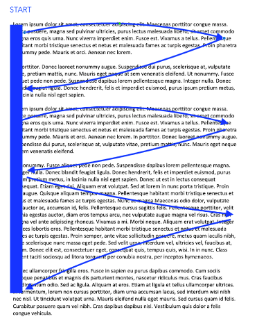
Creating a dominant element in your report shows your reader where to look first. Dominant elements reveal what is most important in your report. If used properly, these elements can even direct how your audience processes the information in your report. For example, in the image below, your eyes likely go to the “look here” box first and then down to the “now here” box and then to the bottom left “finish here.” The reason our eyes follow this path has to do with visual weights – our eyes are attracted to elements with the greatest visual weight.

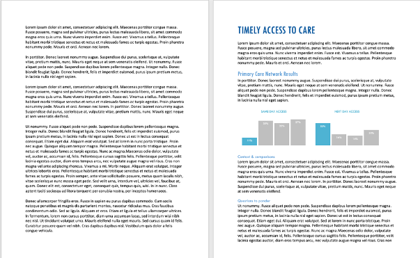
Creating elements with visual weight helps our readers to easily process information. Look at the two pages below. If you are anything like me, you will look at the left and automatically feel overwhelmed. Without a focal point, like a heading, we are creating unnecessary work for our reader that may cause them to close the report. The page on the right is still text-heavy, but we have added in some emphasis using headings and graphs that draw the reader’s attention to what is contained in the text. You will increase readability and have a higher likelihood of engaging your audience using focal points that break up your text.
Creating focal points using visual weights
You should create focal points to emphasize what you want your audience to take away. The page on the right contains focal points that were created using some simple elements that you can incorporate in your reporting.
Size
Large elements have more visual weight than small elements. In the example above, “Timely Access to Care” has the largest font (i.e. more visual weight than other headings), so it draws the eyes to it. Likewise, the graphs are the largest elements on the page, so they draw the eyes there.
Position
Elements located higher on the page are perceived to weigh more than elements located lower on the page. Generally, our eyes will flow from the top left to right in a sweeping pattern as illustrated below. Therefore, your most important information should be positioned in the top left of the page (at least for languages based on the Latin alphabet, where we read left to right).
Colour
Darker elements have more visual weight than lighter elements. You’ll notice in the example above, we’ve chosen blue to highlight titles, headings, and key takeaways from the graph. We then muted the other colours on the page to make the blue pop (hint: contrast also creates visual weight.)
Saturation
Saturated colours appear heavier than desaturated ones. We have bolded our heading of “Timely Access to Care” to create more visual weight.
Intrinsic interest
Some things are more interesting than others – graphs and pictures are some examples of elements that attract the eye. By inserting the graphs in our report, we are creating another focal point to draw the eye to.
The elements described above are just five different elements you can use to create focal points in your report; however, there are many others that you can incorporate as well (i.e., textures, shape, orientation, complexity). When you start considering all of the different elements, it begins to get confusing, wondering which has more visual weight. The bottom line is there are no hard and fast rules – ultimately, creating visual weight depends on how all the elements are used together. Some might say the title on our page has the most visual weight, while others would say the graphs. The most important thing is that you use these elements together to create focal points that draw your audience’s attention to key takeaways in your report.