
Why Pivot Tables Feel So Hard (and what to do about it)
May 2026

About the author: Bonnie Lakusta is a Project Lead at Three Hive Consulting and a Credentialed Evaluator with a doctorate in psychiatry. Bonnie’s background is grounded in research, project management, and change management within healthcare. She brings expertise in facilitation, quality improvement, and evaluation design, with a focus on creating usable data and clear, memorable key messages tailored to diverse audiences.
This article is rated as:


If you’ve ever opened Excel, clicked Insert → PivotTable, and immediately felt your shoulders tense, you’re not alone. I once had a job interview that assigned me a test: Use pivot tables to analyze this spreadsheet. I didn’t get the job.
I feel like an intelligent problem solver, and yet, until recently, I’ve avoided pivot tables. They make me feel….dumb. But, in the last several years, I have gained considerable confidence in pivot tables, so I thought I’d share some key learnings.
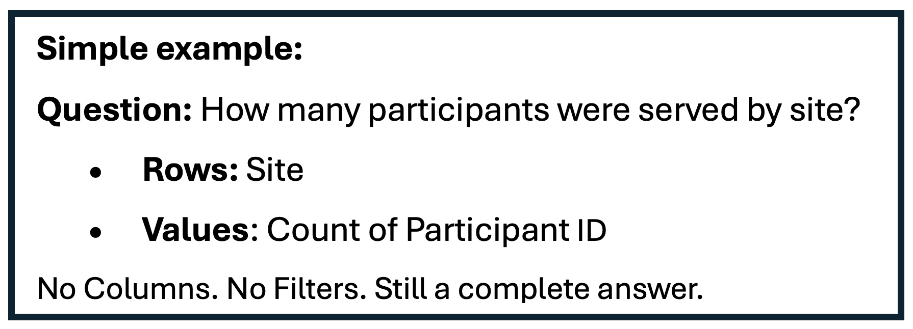
Frustration #1: “I don’t know what a pivot table is supposed to do. When does it help?”
Most online pivot table tutorials start with how-to: click here, drag this, check that box. Very few identify when to use pivot tables in the first place. Check out this companion tip sheet on when to use pivot tables.
In short, a pivot table answers questions:
How many participants fall into each category?
What patterns show up when I group these data differently?
How does this indicator break down by region, year, or population?
If you don’t start with a question, pivot tables feel arbitrary and confusing. A pivot table is Excel’s way of saying, “What question do you have about these data?”
Frustration #2: “My dataset is too messy!”
We’ve all had that data file: full of blanks and missing data, poor data validation, lengthy open-text, inconsistent categories, multiple response formats, and on and on and on. Messy datasets are what we know!
Using a pivot table on messy data may lead to more frustration. If you tried pivot tables and got an unexpected answer (e.g., “I know there were more participants from Region 5!”), it’s easy to think, “I must be doing something wrong.”
Here’s the trick: pivot tables are extremely literal. They don’t interpret meaning; they group exact text. For this reason, using pivot tables on messy data can actually be a secret superpower! You can use those ‘wrong’ pivot tables to understand where your data file needs cleaning.
For example:
Region 5 ≠ 5 ≠ Region5 ≠ Site5
“Yes ” ≠ “Yes”
And….pivot tables treat blank cells as their own category, which is ≠ a space (trailing spaces always cause a mess in pivot tables)
So, in the Region 5 example, the pivot table may reveal to you that you have some text clean-up to do! Pivot tables could be the first tool that reveal data quality issues; that’s actually a strength.
Instead of asking: “What did I do wrong?” Ask: “What is this pivot table telling me about how my dataset is structured?”
Check out these other articles about cleaning messy data or survey design tips to avoid the mess in the first place!
Let Excel do the Math: Easy Tricks to Clean and Analyze Data in Excel[ET6]
How to Combine Data from Multiple Sources for Cleaning and Analysis
Let Excel Do The Math: Easy Tricks To Clean And Analyze Data In Excel
Frustration #3: “I drag my variables into fields, and the pivot table becomes an overwhelming mess!”
This was my biggest complaint. I felt like what I was doing was intuitive, but my pivot tables usually became a large, confusing mess with too many rows and no answers!
The Rows / Columns / Values / Filters field boxes look simple, but the mental model behind them is rarely explained. Here’s my evaluator-friendly version:
Rows = “What do I want to group by?” These are your main categories, usually something like a year or demographic group.
Values = “What am I measuring or counting?” This will be the answer to your question about “how many” or “how much”.
Let me pause here and note: a lot of really useful pivot tables only need these two fields. They group your data, then count it.
Columns = “What do I want to compare side-by-side?” Columns let you make direct comparisons, like pre- and post-testing or comparing scores over years.
Filters = “What do I want to limit or slice?” This field lets you control what cases are included in your pivot table, e.g., site/location, and works much the same way a filter in a spreadsheet works.
Extra tips:
Almost every single useful pivot table needs something that is counted in the Values field.
Adding more than one variable into the Rows field is what (usually) makes pivot tables get unwieldy. What it’s doing is nesting tables. Likely one of those variables needs to go in Columns or Filters.
Pivot tables reward clarity of intent: one question for each table. Sure, it’s possible to get an answer to another question by reusing the same pivot table and restructuring it, but then you’ve lost the first answer! At Three Hive, we tend to use multiple pivot tables to keep the source of what we learned.
Frustration #4: “I feel like I’m constantly breaking something.”
Pivot tables feel fragile or sensitive. You make one little change or drop one more variable in, and your pivot table blows up.
Here’s the thing to keep in mind: You cannot break your raw data by experimenting. Think of pivot tables as views, not transformations. You’re rearranging how Excel looks at the data, not altering the data. Play around, make mistakes, it won’t hurt, but it will help you learn.
A few tips to build your confidence with pivot tables:
Start with your real data. I spent a fair bit of time trying to learn pivot tables by looking at tutorials and examples online. I would feel like it made sense, and when I went to go replicate in my own data, it failed. What eventually worked was just playing around in my own data knowing that I couldn’t break anything.
Ask one clear question at a time. Have that clear purpose, and when you find the answer, (even if it was a fluke!) make note of what you did: what variables went where? How might that change if you change the grouping? Or add a filter?
Pivot tables stop feeling heavy when you stop treating them as a technical hurdle to overcome and start treating them as a thinking tool for working with data. Evaluators already do the hard part: asking good questions. Pivot tables simply give you a faster way to see the answers.
Pivot tables are valuable tools in the evaluator toolkit. I encourage you to test them out! If you’re ready to learn more, check out our Senior Analyst’s Beginner’s Guide to PivotTables.